There isn't a standard set of data that every productivity monitoring tool collects. Tools can range anywhere from doing what punch clocks did to watching everything you can see on a screen.
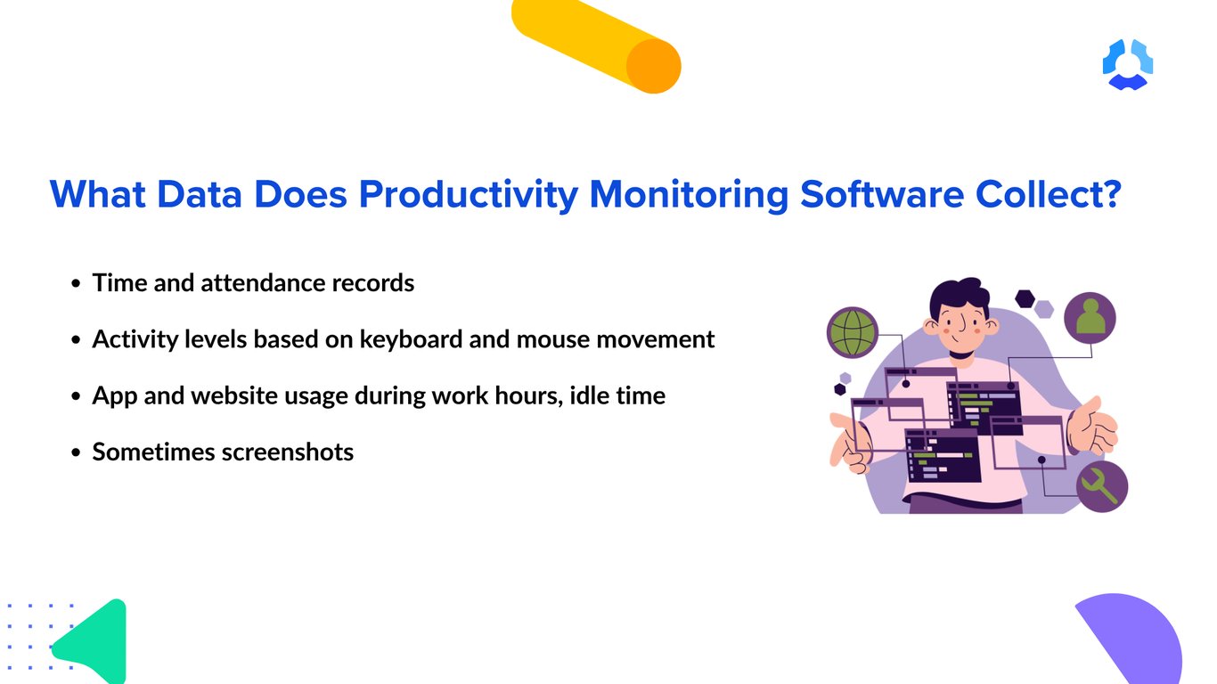
That said, most productivity monitoring tools can track the following data.
Time and attendance data
The most basic layer, and the thing almost every tool does, is keeping track of when somebody worked.
Time and attendance metrics entail essentially zero controversy because, at its core, time tracking is just a more effortless and more precise version of punch clocks. Here’s what time and attendance data typically looks like:
- Hours worked
- Clock-ins and clock-outs, down to the minute
- Breaks
- Time off
- Attendance records
Virtually every productivity monitoring platform builds its tracking capabilities with time tracking as the foundation.
Activity data
This type of data is significantly more detailed than time and attendance data. Tools with time and activity tracking sit very far still from the surveillance end of the spectrum, but it can understandably make teams nervous because many conversations about productivity percentages stem from this metric.
Here are a few common examples of activity data:
- Keyboard activity
- Mouse activity
- Activity percentages derived from the two
- Idle time, or time spent tracking without keyboard or mouse activity
It's important to distinguish activity metrics from keystroke logging. Most productivity monitoring tools that report activity percentages only measure the presence of keyboard and mouse input. They don't record what employees type. Some monitoring tools do include keystroke logging, but that's a separate, more invasive capability.
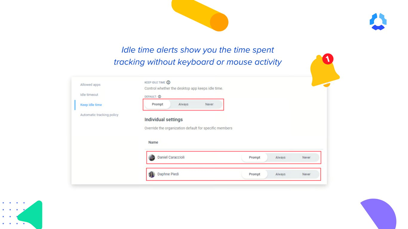
Activity data is very contextual and should be treated as such. Someone on customer calls or in meetings will naturally have lower activity levels than someone doing data entry, even if both are equally productive.
For that reason, activity data shouldn't be used as a standalone measure of employee performance.
Website and application usage data
Whereas activity tracking focuses on how much movement was made by the employee, this category focuses on how employees spend their time. It shows which applications they use, which websites they visit during work hours, and how long they spend in each.
This category usually covers:
- Applications used and time spent in each
- Websites visited and time spent on each
- Work-related vs non-work-related browsing
- AI tool usage
As AI adoption grows, many productivity monitoring tools now identify when and how employees use AI applications.
Some tools, including Hubstaff, go a step further by classifying apps and websites as productive or non-productive. Because productivity varies by role, these classifications are typically configurable rather than fixed.
Like any monitoring data, web and app tracking works best when it's configured thoughtfully. A website that's productive for one role may be irrelevant or distracting for another.
Screenshots and work verification data
Screenshots are one of the more sensitive types of monitoring data. For some organizations, they're important for compliance, client billing, or verifying work. For others, they're unnecessary.
Because screenshots can capture personal or confidential information, most tools let administrators decide:
- Whether screenshots are enabled at all
- How often they're taken
- Whether they're blurred
- Whether they can be deleted, in case one caught something that had nothing to do with work
These controls matter because screenshots are best suited to work verification, not continuous surveillance.
For example, Hubstaff offers optional screenshots that administrators can configure based on their needs. Team members can blur or delete screenshots if they capture personal or confidential information.
Productivity and workforce analytics data
This is where individual data points become operational insights.
Instead of zeroing in on one point in time or a single metric, the workforce analytics looks at big-picture patterns across weeks, teams, and even industries, to clearly understand how work is happening inside the organization.
This category includes workforce analytics metrics like:
These insights help organizations answer questions that individual activity data can't. Are some teams consistently overloaded? Is work distributed evenly? Are certain processes creating bottlenecks? Where is capacity available?
Instead of measuring individual output, workforce analytics supports better planning, staffing, resource allocation, and operational decision-making.