Why Our Team Data Shows Idle Time Isn’t a Productivity Score

 7 min read
- Idle time only captures device inactivity — not meetings, tutorials, or AI wait time. Leaders who treat it as a productivity verdict risk misreading their most engaged employees.
- Hubstaff's idle time data reflects employee choices: workers decide what to keep or discard, a critical context detail that never appears on the chart but shapes every number you see.
- Effective workforce analytics means pairing idle time with activity rates, focus time, and output trends — then using patterns to start supportive conversations, not render verdicts on individuals.

If you lead a remote or hybrid team, someone has probably asked you some version of this question: how do you know your people are actually working? Maybe it came from a peer who never quite bought into remote work, or from an in-law who just doesn’t get how you do your job from home. Perhaps you’ve even asked yourself the question after a week of work seemingly got away from you.
It’s a hard question to answer because the whole story usually involves output, combined with judgment and proof. None of that fits neatly on a dashboard. That’s why it’s so tempting for leaders to reach for a number that makes the complex easy. Often, idle time is a metric that leaders connect with. It looks objective, it’s easy to chart, and it seems to answer the question head on.
I recently got to test that instinct with my own team. We pulled 12 weeks of time data for the Hubstaff Marketing team I lead, and across 4,326 tracked hours, the dataset contained just 12.4 hours of kept idle time. That’s 0.29% of tracked time. That number looks great on a slide and part of me wanted to celebrate, but pause… it’s more complicated.
Digging deeper to understand our team’s idle time turned out to be more useful than trotting around the stats.
Leaders should ask themselves: What does an idle time metric actually tell me and what does it leave out?
Stay in the loop
Subscribe to our blog for the latest remote work insights and productivity tips.
What we analyzed
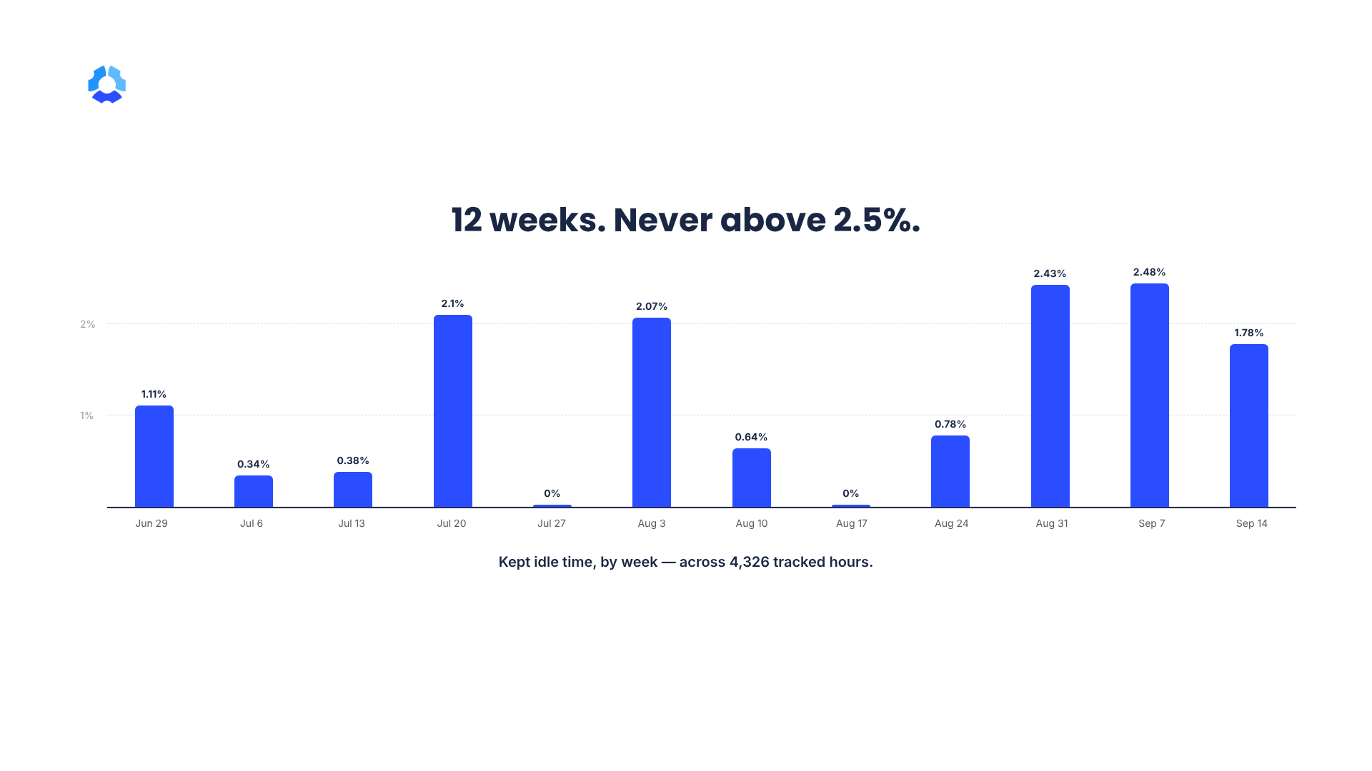
Over the course of 12 weeks, my marketing team of 13 people (including design) tracked a combined 4,326 hours, and 234 of those hours were entered manually. Kept idle time added up to 12.4 hours, or 0.29% of tracked time, and it ranged from 0% to 0.69% in any given week. I should note that everything was pulled in aggregated, anonymized form, so none of what follows is about any one person.
Here’s how it played out week by week. These aren’t good weeks or bad weeks. It’s just data, and I’ll explain later why the weekly movement is hard to interpret.
| Week starting | Tracked hours | Kept idle time (% of tracked) |
| Jun 29 | 224.6 | 1.11 |
| Jul 6 | 308.9 | 0.34 |
| Jul 13 | 371.5 | 0.38 |
| Jul 20 | 372.6 | 2.1 |
| Jul 27 | 319.2 | 0 |
| Aug 3 | 299.5 | 2.07 |
| Aug 10 | 374.2 | 0.64 |
| Aug 17 | 392.4 | 0 |
| Aug 24 | 403.8 | 0.78 |
| Aug 31 | 443.3 | 2.43 |
| Sep 7 | 374.7 | 2.48 |
| Sep 14 | 465.2 | 1.78 |
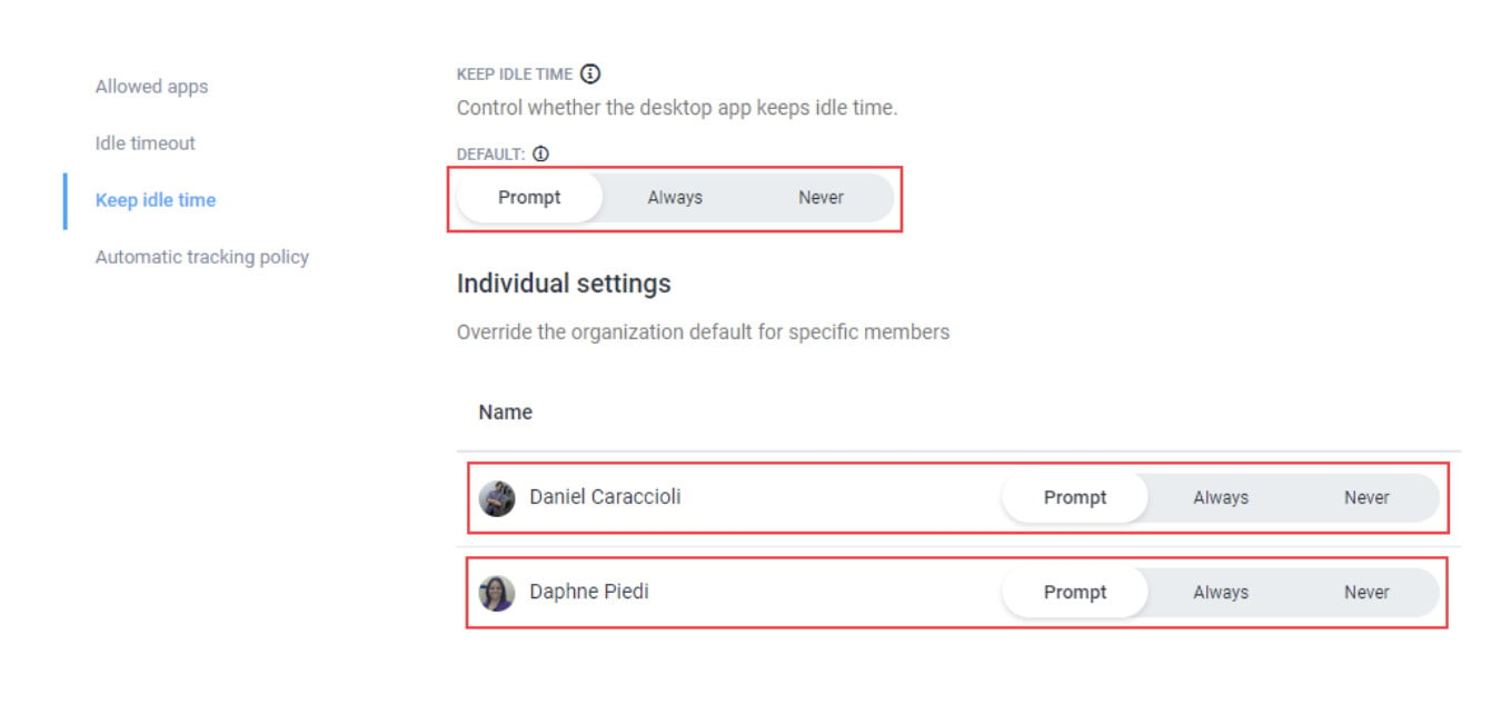
So, what is kept idle time? With Hubstaff, you can automatically detect when there’s been no keyboard or mouse input for a set stretch of time, and it then asks the person what to do with that time. They can keep it on the clock or discard it.
The number was accurate, but incomplete
That creates three different buckets:
- The idle time Hubstaff detected.
- The idle time people chose to keep.
- The idle time people chose to discard.
Our dataset only contains bucket no. 2. Discarded idle time isn’t stored anywhere, not even in the Hubstaff app.
The 0.29% reflects the idle time that was detected and that someone on our marketing team decided to keep.
What people were doing during kept idle time
Some leaders might think that if keyboards aren’t clicking and mice aren’t moving, work isn’t happening. That’s what a real workday looks like, though. I asked our team members what was happening during their kept idle time.
The most common answer: meetings.
We could all see that one coming, but there were a few other answers that were revealing:
- Watching a long video or tutorial
- Waiting on AI to finish processing something
- An unscheduled, virtual discussion or huddle
Most of the reasons people gave were work that simply doesn’t involve a keyboard. They were sitting in strategy discussions, collaborating with each other, and learning how to do their work more effectively. One metric can’t tell you the whole story.
A stretch with no device input can mean someone checked out. It can also mean they were fully engaged in the most important conversation of their week. The idle metric on its own has no way of telling those two apart.
Configuration changes what gets measured
Measures and metrics can change based on the way you choose to configure Hubstaff. Most of the team has a 20-minute idle timeout, and a few have 10 minutes. Those are today’s settings. We don’t keep a history of changes, so I can’t tell you whether a busier idle week reflects different work or a different setting. That’s why I won’t read anything into the weekly swings.
That means two people could step away from their keyboards for the exact same 15-minute call and end up with different data. For the person on a 20-minute timeout, nothing gets flagged at all. For the person on a 10-minute timeout, it triggers a prompt and may end up as kept idle time on the record. Same work, different data.
Data matters, but there are many factors that tell the story of someone’s productivity.
Three important takeaways for leaders
1. Define the metric before you interpret it
By the time a number reaches a dashboard, it has already passed through a set of rules and choices. Before you draw a conclusion, find out what’s recorded, what’s left out, and what decisions the employee makes along the way. In our case, the single most important fact about the idle metric was that people decide what gets kept, and that fact doesn’t appear anywhere on the chart.
2. Ask what was happening around the number
Look at the context: how many meetings someone had, what their role actually involves, and the quality of their output. Idle time during a team meeting or a strategy session means something very different from an unexplained pattern that keeps showing up week after week. A designer in a long feedback session and someone who has quietly disengaged can look identical in this one metric.
3. Use workforce data to start a conversation
Treat idle time as one factor, not the whole picture. Look at trends over longer periods, and read it next to focus time, activity, workload, and output. Good workforce analytics should prompt conversations. The goal is to spot friction and offer support. Rewarding people for keeping their mouse moving is not helpful.
What I’m taking away as a marketing leader
When I first saw 0.29%, I took it as a good sign. Not the only good sign, but one of them. For my team, kept idle time under 1% week after week feels right. Your number will look different depending on the work. Our productivity benchmarks show how much this varies across roles and industries. I never expected it to be zero. I do want to be clear about one thing, though. This is one data pull for one team, so 0.29% isn’t a target for my team or anyone else’s.
Our marketing work swings between heads-down time and a lot of collaboration. Some days we’re getting things done in a doc or a design file, and other days are packed with meetings. If you’re fully engaged in a meeting and not touching your keyboard or mouse, you might get an idle alert and choose to keep that time. That’s completely acceptable and understandable to me, and it happens to me too.
I have expectations for how the work gets done. I look for an activity rate that stays above 35 to 40%, people hitting their expected hours each week, and no large blocks of idle or manual time showing up across multiple days. I also keep guardrails around meeting time and time spent in unproductive apps or URLs. If someone consistently falls outside that baseline, it raises a flag for me. One atypical day doesn’t make a trend, but a pattern is worth a closer look, and ultimately a conversation with that person to understand the context behind the numbers.
That context matters a lot. Say a designer gets flagged for high mouse usage and a high activity rate, but very little keyboard input. Before reading anything into that, I’d check their project tracking and how their app and URL usage is classified. If they were doing illustration or animation work, that’s mostly mouse work with little reason to type, and the pattern makes complete sense.
Still, those inputs aren’t the thing I ultimately judge my team on. What matters most is the projects, campaigns, content, and results we deliver. We’re big users of OKRs on the Marketing team, which keeps everyone aligned on transparent goals they’ve committed to and are accountable for, and those goals tie directly to how the business performs.
When it comes to talking with people about activity data, I start by assuming positive intent and treating everyone as a human being, not a machine. I have a Hubstaff Smart Notification set up to alert me daily when anyone’s activity rate drops below 35%. When that alert fires, I treat it as a reason to check in and ask what’s going on, not as a verdict on the person.
During those conversations, I try not to lead the witness. I simply name the change I noticed and ground it in their own baseline, not a comparison to anyone else, and let them tell me what’s going on. Depending on the answer, that might mean clearing a roadblock, shifting workload, or just learning they’ve picked up a demanding new project.
Back to that 0.29%
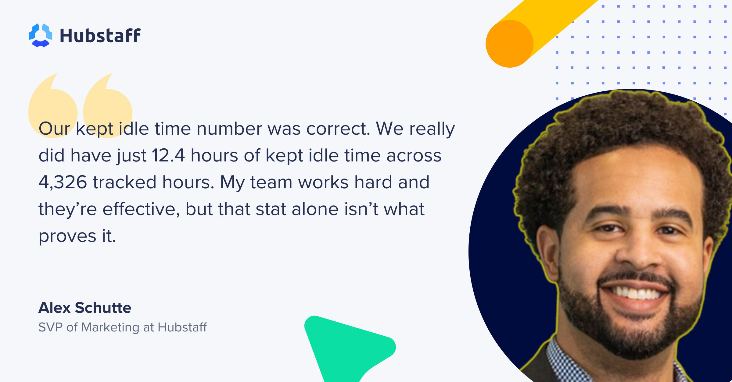
Our kept idle time number was correct. We really did have just 12.4 hours of kept idle time across 4,326 tracked hours. My team works hard and they’re effective, but that stat alone isn’t what proves it.
Using workforce data responsibly means understanding what data can and can’t show. Idle time is data about device interaction, not a complete record of productivity. If you want the longer version of that distinction, we cover it in Idle Time vs. Unproductive Time.
If you use productivity monitoring with your team, hold yourself to that standard out loud. Tell them what gets recorded, what their choices change, and how you’ll use the numbers. In Hubstaff, everyone on my team can see the same activity data I see, so nobody’s guessing what’s on my dashboard. Workforce data, used with that understanding, helps you support people; without it, the same data only leads you to misjudge them.
Most popular
The Best Coaching Conversations Start With Productivity Data
Most coaching conversations happen too late. A deadline is missed, or a client flags a problem, and then a manager schedules a sit...
A Quick Guide to Work Order Management
From quick fixes to long-term stability, work orders are crucial to asset management and helping managers keep operations running...
How to Identify High Performers Using Work Patterns
Every business has top performers, and managers are told to find them all the time. But in most cases, they default to approaches...
The AI Productivity Panel: Lessons From Leaders on What’s Working (and What’s Not)
When I moderated this AI productivity panel, I expected a solid conversation. What I didn’t expect was the flood of real-world i...