Employee Performance Dashboards: Templates, Tools, and Best Practices
- Employee performance dashboards replace fragmented spreadsheets by consolidating productivity, attendance, task completion, and engagement scores into one visual tool that drives faster, informed decisions.
- Effective dashboards prioritize actionable metrics over raw data — keep visuals simple, audit inputs regularly, and update tracked metrics to stay aligned with evolving business goals.
- Hubstaff eliminates manual reporting by integrating time tracking, activity levels, scheduling, and payments into one platform, automating data collection so managers can act on insights faster.

Keeping track of how your team’s really doing can be tricky. Spreadsheets pile up, one-on-ones only tell part of the story, and gut instinct isn’t always enough — that’s where a good employee performance dashboard can make a big difference.
Dashboards can give you a clear overview of your team’s performance metrics, help you focus on the right key performance indicators, and show where things are running smoothly or getting off track.
Think of it like a business performance dashboard but for the people side of things. It’s designed to improve operational efficiency and keep your team moving toward continuous improvement.
When done right, a dashboard supports your people and helps you make better day-to-day decisions. But before we teach you how to set one up, let’s better understand employee performance dashboards.
See Hubstaff in action
Watch our interactive demo to see how Hubstaff can help your team be more productive.
What is an employee performance dashboard?
An employee performance dashboard is a tool that collects your team’s most important performance data. This data might include metrics like productivity, attendance, task completion, and more.
These tools turn that information into useful data visualizations so you can gauge performance for multiple employees with just a glance — and easily share that information with key stakeholders who aren’t as in the weeds.
Key benefits for HR and managers
A good dashboard can help HR teams:
- Make informed decisions. Instead of guessing or going off vague impressions, you’re working with real numbers and trends. This makes it easier to set goals, adjust workloads, and spot problems before they become larger issues.
- Aid in employee development. Tracking progress on key metrics enables smoother conversations during reviews. It also allows you to give clearer, more personalized feedback.
- Support the hiring process. Dashboards can reveal gaps or patterns in team performance that highlight what kind of roles or skills you need to hire for.
- Improve employee engagement. People feel more connected to their work when they know what’s expected of them ( and how they’re doing).
- Identify bottlenecks. The data will usually show if something is slowing the team down. This gives you a head start on fixing the root cause instead of just reacting.
- Save time on reporting. Instead of digging through spreadsheets or running the same reports repeatedly, dashboards give you a live snapshot of the situation.
Performance dashboards remove the guesswork from managing people, giving you more time to support them.
Examples of use cases in organizations
Dashboards aren’t just for big companies with data teams. Teams of all sizes can use them to better understand what’s working and what needs more attention.
- Tracking remote team productivity. For distributed teams, dashboards help visualize work progress and spot when someone might be overloaded or stuck.
- Monitoring training impact. HR can use dashboards to see how performance shifts after new training programs are rolled out, tying real data to learning.
- Performance reviews with real context. Instead of relying on memory or subjective notes, managers can pull up actual trends to guide conversations in huddles, one-on-ones, and performance reviews.
- Workforce planning and forecasting. Dashboards can highlight trends that help improve workforce management, like when a team is stretched too thin or hitting capacity.
- Spotting and addressing burnout. Consistent dips in performance or engagement metrics can signal that someone’s struggling.
Dashboards give you a simple way to check in on your team’s health without navigating a dozen different systems, but what should you include in them?
What should be included in a performance dashboard?
The right dashboard should give you a clear, honest view of how your team is doing with minimal effort.
For HR professionals and team leaders, it’s a practical tool that integrates everything they need for better performance management and day-to-day decision-making.
Key metrics to track
At a minimum, your dashboard should cover:
- Productivity levels. Are people getting meaningful work done over time? This helps you identify trends, gauge utilization rates, and optimize productivity.
- Attendance. Patterns in absences or late starts can signal bigger issues like burnout, disengagement, and attrition.
- Task completion rates. Task completion rates help you gauge how consistently your team completes their work. They can also highlight potential skill gaps.
- Employee feedback or engagement scores. These scores are useful for monitoring morale and team satisfaction. Failure to do so can damage morale and lead to productivity loss, disengagement, and high turnover.
- Time spent on tasks or projects. Compared with output, this helps track efficiency and improve organizational performance over time.
Each of these metrics tells part of the story. But together, they give actionable insights that lead to better planning and stronger teams.
Customizing dashboards for different teams and goals
Not every team works the same way or has the same goals.
A sales team might care more about sales performance metrics like calls made or deals closed, while a support team might be focused on customer retention rate, response time, ticket resolution time, and customer satisfaction. That’s why customization matters.
Pulling in historical data lets you set meaningful benchmarks, and tailoring the view for each team keeps it relevant and useful. When the dashboard speaks your team’s language, it becomes a tool they’ll want to use instead of another report to keep putting off.
Types of employee performance dashboards
There’s no one-size-fits-all approach to tracking performance. The best setup depends on your tools, goals, and how deep you want to go with your data.
Dashboard templates for Excel
If you’re just starting out or want something simple, an Excel performance management dashboard can help.
You don’t need anything fancy. Start with some simple information like:
- Columns for names
- Roles
- Key tasks
- Completion rates
- Time worked
- Goals or notes
You can highlight trends using conditional formatting or basic charts and have a lightweight but useful snapshot. It won’t update automatically, but it’s easy to build and share.
Power BI performance dashboards
Power BI is Microsoft’s data visualization tool. It’s more advanced than Excel but still fairly approachable once you get the hang of it. You can connect it directly to systems like time tracking tools or project management platforms and pull in real-time data automatically.
This setup is great if you want to make data-driven decisions quickly and spot changes as they happen. You can slice the data by team, timeframe, project, or person and build financial dashboards that feel less like spreadsheets and more like interactive scorecards.
Free and paid dashboard tools and examples
If you’re looking for tools that are ready to go (or close to it), here are a few solid options:
- Google Data Studio. Good for visual dashboards using live data from Sheets, Forms, or even external apps. It takes a bit of setup but offers clean, customizable dashboards once it’s in place.
- Klipfolio. Lets you pull in data from different sources and create shareable dashboards. It’s flexible and works well for small teams.
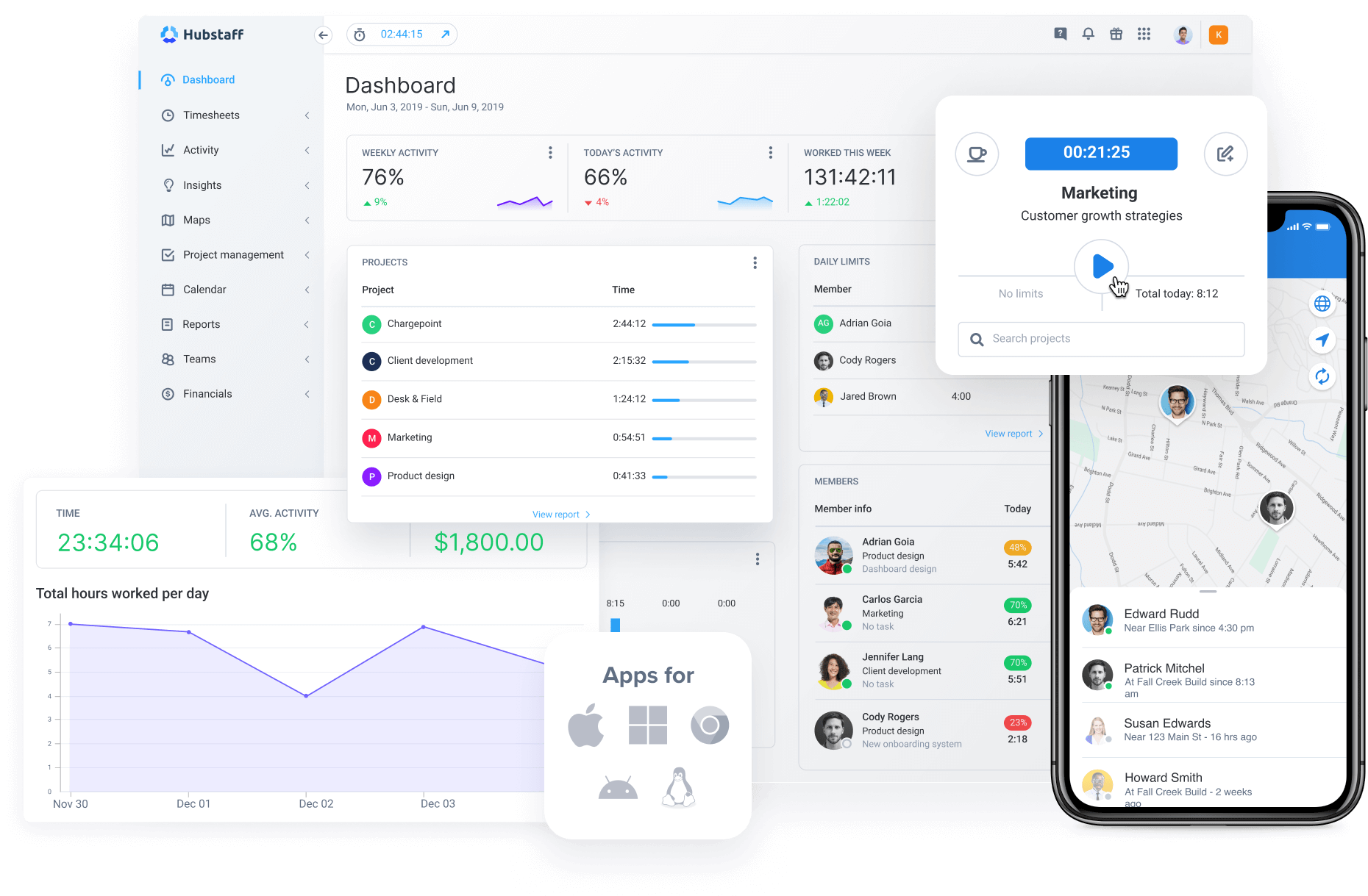
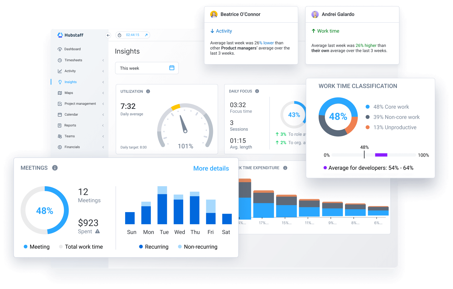
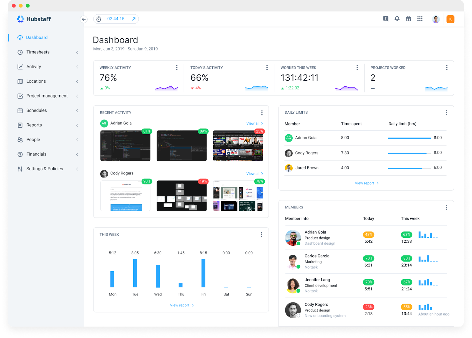
- Hubstaff. Super simple to use. Just track time, and it automatically generates performance metrics like activity levels, hours worked, and task progress. With the Hubstaff Insights add-on, you can access deeper metrics like industry benchmarks, utilization rates, focus time, and time spent on meetings.
- Databox. Designed for teams that want quick access to performance data without spreadsheets. You can connect tools like Slack, Trello, or Google Analytics and build a central dashboard view.
- Zoho People. More of an all-in-one HR tool, but it includes dashboard features that track performance, time off, and more. Useful if you want something tied into broader HR functions.
There are many HR dashboard examples, but these tools make it easier to get started without needing to be a data expert.
How to create an employee performance dashboard
You don’t need to be a data wizard to build a dashboard that works.
Whether you’re using Excel or Power BI or grabbing a ready-made template, the goal is the same: to consolidate your own performance data into one place so you can better manage your team.
Step-by-step guide for Excel users
Here’s a basic way to get started with an Excel employee performance dashboard, even if you’ve never built one before:
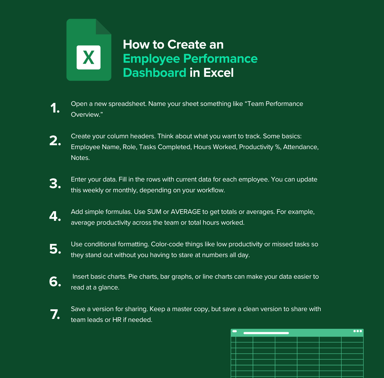
- Open a new spreadsheet. Name your sheet something like “Team Performance Overview.”
- Create your column headers. Think about what you want to track. Some basics are the following: Employee Name, Role, Tasks Completed, Hours Worked, Productivity %, Attendance, and Notes.
- Enter your data. Fill in the rows with current data for each employee. Depending on your workflow, you can update this weekly or monthly.
- Add simple formulas. Use SUM or AVERAGE to get totals or averages. For example, average productivity across the team or total hours worked.
- Use conditional formatting. Color-code things like low productivity or missed tasks so they stand out without you having to stare at numbers all day.
- Insert basic charts. Pie charts, bar graphs, or line charts can make your data easier to read.
- Save a version for sharing. Keep a master copy, but save a clean version to share with team leads or HR.
The result won’t be fancy, but it’ll give you something real to work from.
Using Power BI for interactive dashboards
Power BI is essentially a tool that turns raw data into slick visuals you can click through. Unlike Excel, it updates automatically when the source data changes (think real-time data, not static reports).
- Pull in your data source. This could be a CSV file, Excel sheet, or other type of report.
- Use the drag-and-drop interface to build visuals. These include bar charts, scorecards, timelines, or whatever helps you see the story.
- Filter it down. You can do this by department, date range, or individual employee.
- Share your dashboard. Share with your team or managers through a secure link. No exporting needed.
Power BI is much more intuitive than Excel but has a learning curve. It’s worth it if you’ve got time to tinker or have someone on your team who thrives on this type of work.
Leveraging pre-built templates for quick implementation
Pre-built templates are your best friend if you want something that works without starting from scratch.
You can find free and paid employee dashboard templates online — many are already formatted to track things like task completion, time worked, and basic key metrics. All you have to do is plug in your data. Some even come with charts and conditional formatting ready to go.
If an existing template can get the job done, there’s no shame in not building from scratch.
Features of an effective employee performance dashboard
Effective dashboards are not only informative but also useful. What good is data if it’s not actionable?
Let’s examine a few key features of employee performance dashboards and how they can help you achieve tangible results.
Real-time updates and reporting
Real-time updates mean your dashboard reflects what’s happening right now.
This instantaneous visibility helps human resources professionals and managers respond faster and more confidently. It also makes regular check-ins and performance reviews way easier to prepare for.
Integration with HR and time tracking tools
If you have to pull reports from three different systems and manually copy them into a spreadsheet, you’re wasting time.
Seamless integration with existing tools like HR software or time tracking apps is one of the key capabilities that separates a helpful dashboard from a frustrating one.
The more connected your tools are, the more clearly you can see the full picture. This reduces human error and saves a lot of time.
Customizable visuals for clarity
A cluttered dashboard is almost as bad as no dashboard. You should be able to adjust the layout, choose how data is displayed, and focus on the metrics that matter to your role or department.
Visuals need to be clean and intuitive because they provide a high-level overview of your organization’s performance. When people understand what they’re looking at, they’re more likely to take action.
How Hubstaff simplifies employee performance tracking
Managing a team’s performance can feel like juggling several spreadsheets while trying to read between the lines.
Hubstaff cuts through that noise by bringing everything into one place (time tracking, productivity data, reporting, etc.) so you can see what’s really going on and make decisions that move your team forward.
Integrating time tracking with performance dashboards
At its core, Hubstaff is a time tracker, but it’s more than just a digital stopwatch. It captures how long tasks take, what apps and websites are being used, how active someone is during their workday, and real-time earnings.
This data feeds directly into your dashboard, giving you a clear picture of how time is spent across projects and team members. You can spot patterns, flag potential performance issues, and understand where time might be slipping through the cracks without constantly looking over their shoulders.
Automating data collection and reporting
Manually collecting data is time-consuming and prone to mistakes. Hubstaff automates this process by generating reports on hours worked, activity levels, and project progress.
These reports are customizable and can be scheduled to run automatically, so you’re always up to date without lifting a finger. This kind of automation frees you up to focus on strategic decisions instead of data entry.
Improving workforce management
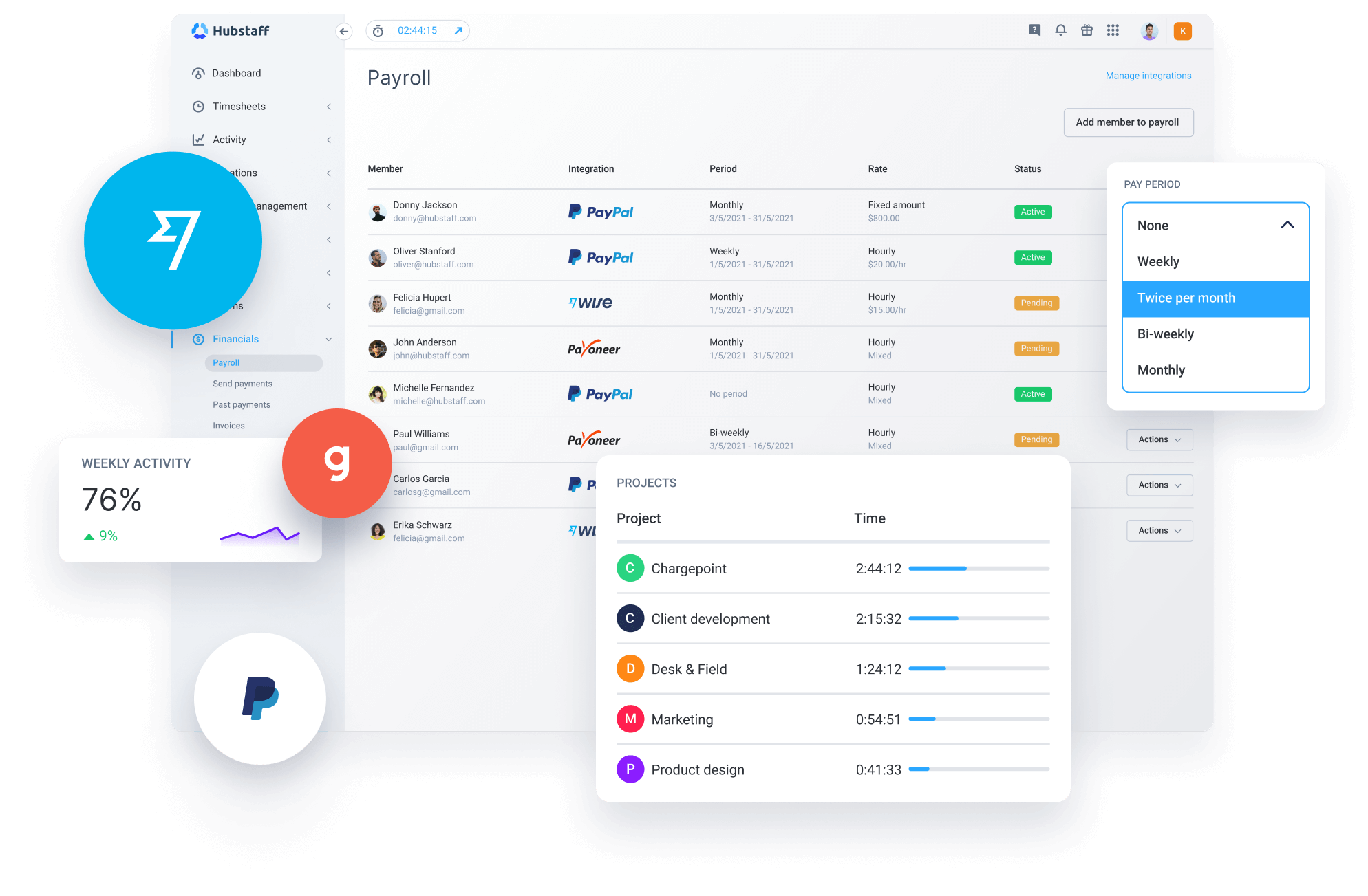
Beyond tracking time, Hubstaff offers tools to manage your team more effectively. You can schedule shifts, approve time off, and even send payments through various different providers directly from the app.
Together, these features provide a holistic view of your team’s workload and availability, which makes it easier to allocate resources efficiently. This cohesive approach supports your team’s overall success by ensuring everyone is aligned and working at their best.
Best practices for using employee dashboards
Dashboards are only useful if they actually help you understand what’s going on. A clean layout and good data can do a lot, but it’s the habits behind the dashboard that really shape how useful it becomes over time.
Ensure data accuracy
If the numbers are off, everything that follows will be too.
Your dashboard is only as good as the data collected, so it’s worth double-checking that the sources feeding into it are reliable and consistent.
Make it a habit to audit your inputs every now and then — especially when something looks off.
Keep dashboards simple and intuitive
Nobody wants to scroll through ten tabs to find out what’s going on. The best dashboards are clean, focused, and easy to read at a glance. You don’t need to track everything; it’s just what helps you take action.
Here are a few quick sanity checks:
- Can someone understand it without needing a walkthrough?
- Are the charts readable without squinting?
- Does it highlight trends and business outcomes, or just dump raw numbers?
- Is the data grouped in a way that matches how your team works?
Get rid of the noise and keep what’s useful. That’s how dashboards stay relevant over time.
Regularly update metrics to reflect business goals
Your goals change, so your dashboard should change with them.
What mattered last quarter might not matter now. Maybe you’re focusing more on customer satisfaction scores. Maybe it’s about efficiency. Or, maybe you need better visibility into resource allocation.
Revisit your metrics regularly. Ask yourself:
- What decisions am I trying to support?
- What does my team need to see every week?
- Are we tracking results that tie back to meaningful outcomes?
Keeping your metrics aligned with current priorities makes your dashboard a real tool for progress.
FAQs about employee performance dashboards
What is an HR dashboard for employee performance?
An HR dashboard for employee performance is a tool that gives teams a clear snapshot of how employees are doing. It tracks things like attendance, productivity, engagement, and goal progress in one place. HR can use the dashboard to spot patterns, catch performance issues early, and make better decisions about hiring, development, or even retention.
How do I choose the right dashboard template?
Start by getting clear on what you’re trying to track. If you’re focused on task completion and time management, your dashboard needs to reflect that.
If you’re more concerned with goals or coaching, you’ll want something that includes individual progress and feedback history. The right template should feel natural for the kind of work your team does. Avoid anything bloated with features you won’t use. A basic, readable layout that fits your team’s workflow will always serve you better than something overly complex. At the end of the day, a dashboard is about protecting your organization’s financial health, not reinventing the wheel
What tools are best for creating dashboards?
This depends on how hands-on you want to be and how much data you’re dealing with. Excel and Google Sheets are great if you want something lightweight and fully customizable — you’re building it yourself, but it’s easy to tweak and share.
If you want something more automated, Power BI is a solid step up. It lets you pull from multiple sources, work with real-time data, and create dashboards that update themselves. For teams that want quick setup and clean visuals without coding, Google Data Studio is a good choice. The best tool is the one you’ll want to keep using over a long time, not the flashiest one.
Track employee performance the smart way
A good employee performance dashboard just makes your life easier for business leaders. It helps you keep a pulse on how your team’s really doing, and when it’s done right, you’ll always know where to go next.
You don’t need a background in data to build one that works. Just start simple, track what matters, and check in regularly. Over time, that kind of visibility adds up. You’ll make better calls and spend less time putting out fires.
If you’re looking for an easy way to track time and pull that data into something useful, Hubstaff is a solid place to start. It takes care of the tracking so you can focus on what actually improves cash flow and has a positive impact on financial performance.
Most popular
7 Tools That Help Monitor AI Usage at Work in 2026
AI is everywhere. Adoption continues to grow, but from monitoring AI usage, we’ve learned that daily use is still a mixed bag, a...
Hidden AI Usage in the Workplace: What Your Tools Don’t Tell You
How much has AI changed your team’s work? On the surface, work might not look that different. The meetings are still there, docu...
How Many Meetings Are Too Many? 2026 Benchmarks by Role
How many meetings are too many? In 2026, the honest and boring answer is: it depends on your role. Our 2026 Global Trends and Benc...
When Evening Work Becomes a Red Flag: How to Fix Triple-Peak Overload with Smarter Core Hours (2026 Data)
Most people don’t remember the first time they worked in the evening, and even fewer people know when the last evening work sess...